

Prompt: Millions of animals are currently in shelters and foster homes awaiting adoption. Design an experience that will help connect people looking for a new pet with the right companion for them. Help an adopter find a pet which matches their lifestyle, considering factors including breed, gender, age, temperament, and health status. Provide a high-level flow and supporting wire frames.
I kicked off the design process by defining the problem and high-level goals. Based on the prompt, I wrote down a long list of questions that came to mind and assumptions I wanted to test. I also jotted down assumptions about my target audience, including people seeking pets and employees at animal shelters and rescue groups.
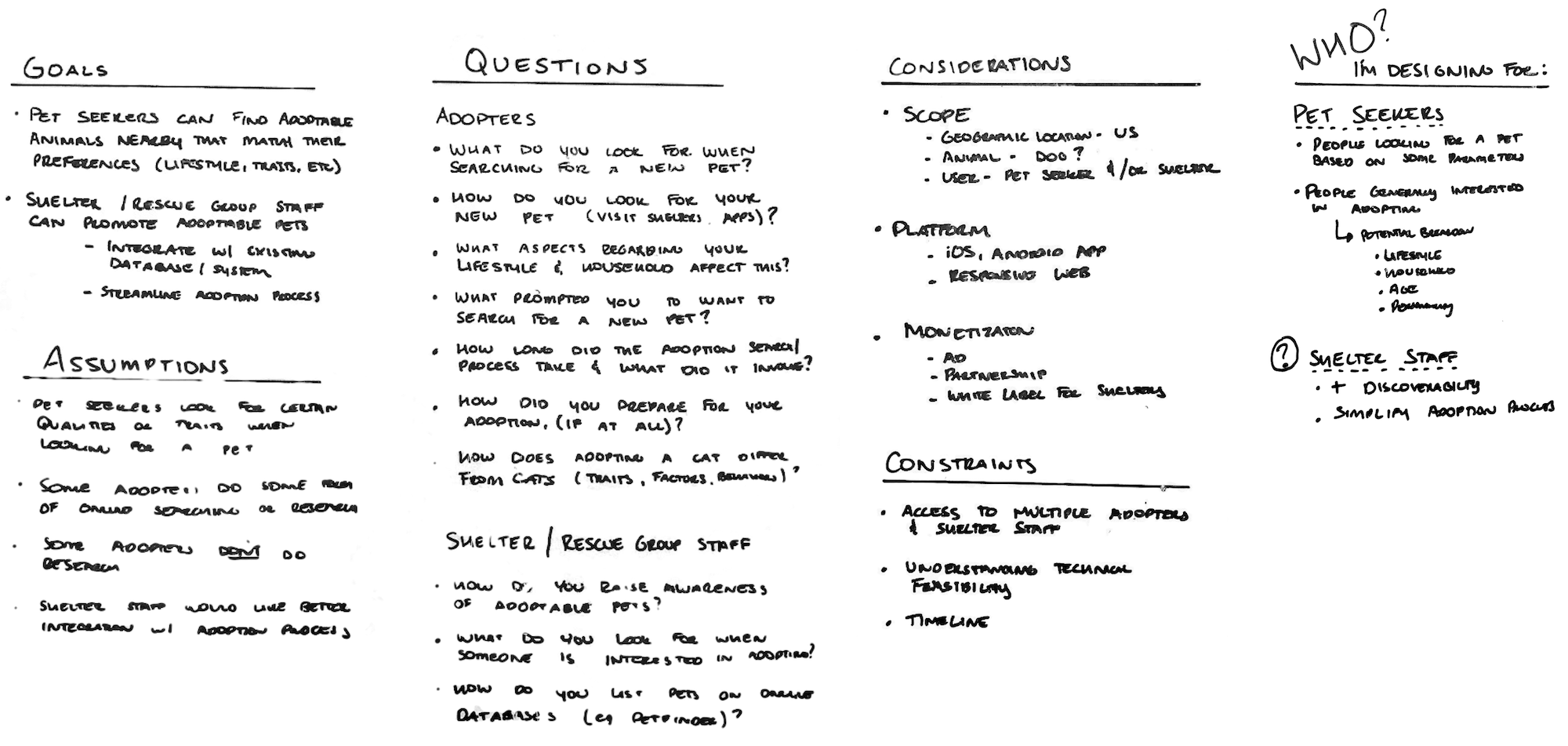
Given time and resource constraints, I scoped the project based on a few assumptions:
Once I defined the design problem, I created a rough project plan that outlined design methods and deliverables that best matched my goals and short timeline. While I didn’t follow every step of the plan, it did help keep me on track throughout the project.
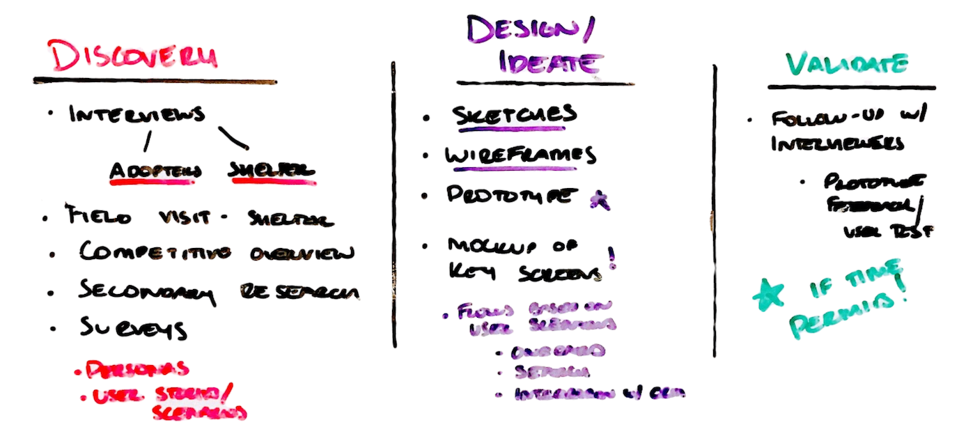
During the discovery phase, I reviewed existing literature, visited a nearby shelter and used several pet adoption services. I also interviewed four recent pet adopters and two shelter employees to begin understanding user needs, behaviors and pain-points.
I primarily used secondary research to get more context on thoughts and behaviors of pet seekers during the adoption decision process. Here's a few key insights that influenced my design:
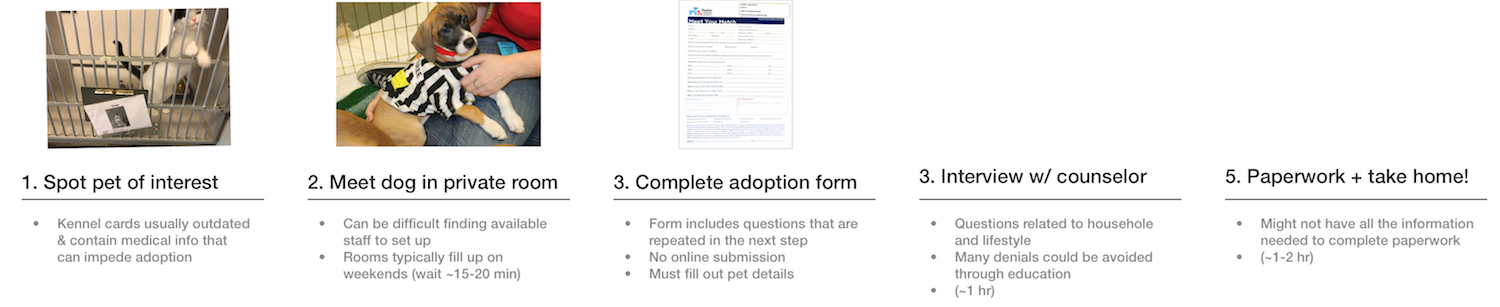
I was really interested in seeing a pet adoption in action to get direct exposure to the users' entire context. I visited a local animal shelter and observed several stages of a pet adoption, including first interactions with a potential pet to completing the adoption paperwork. Below is a typical adoption process.
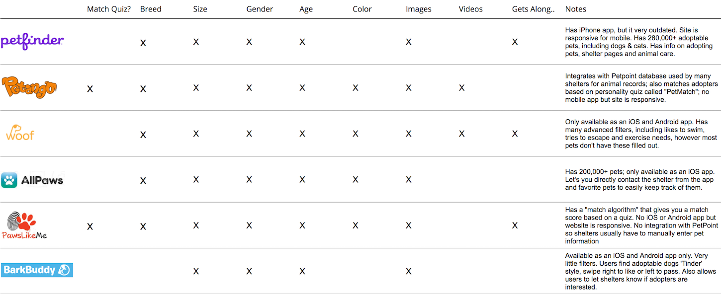
I reviewed 8 similar apps and services to get an understanding of what competitors are doing and look for opportunities to innovate. I explored different filters each app provided and identified some best practices. A few takeaways include:
During the discovery phase, I started sketching out different scenarios for pet adopters and created proto-personas to capture common patterns that surfaced, including user needs and behaviors. The personas also represent different user types based on their household and lifestyle.
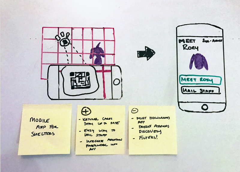
With a sketchbook and research notes in hand, I worked through more than a dozen different design ideas, many of which I ended up using for inspiration. I narrowed my ideas down to three and worked through the pros and cons of each.
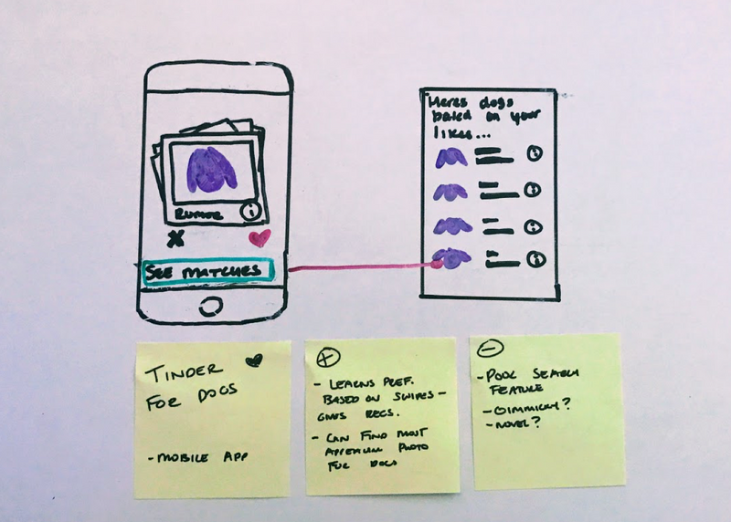
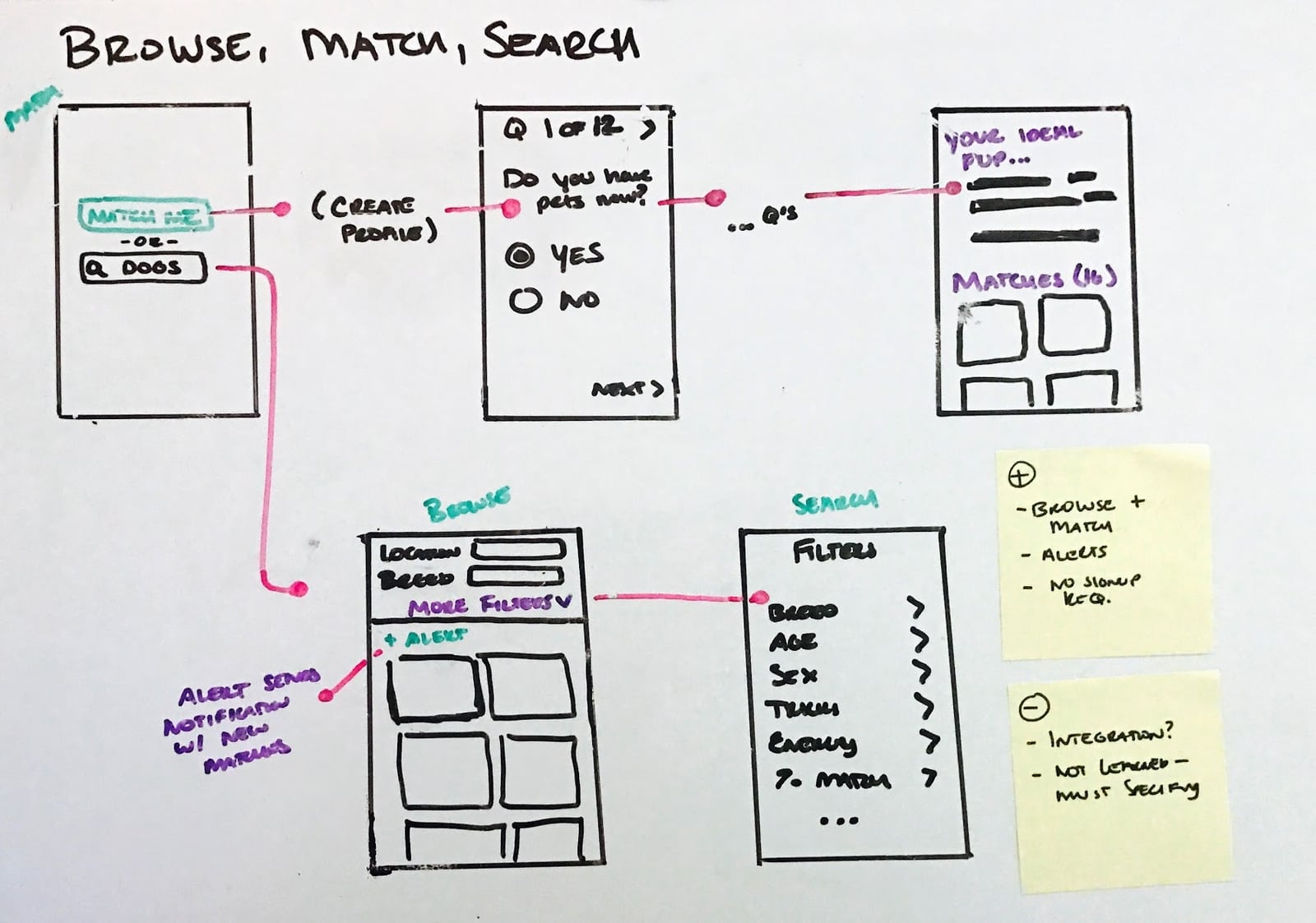
I had the opportunity to share my ideas with a recent pet adopter for feedback. Based on their input and a review of my research, I decided to move forward with the Browse, Match or Search concept.
My research revealed that people look for and adopt pets in very different ways - some know exactly the dog breed and other traits they want, some do no research prior to adopting, and some are in between, casually browsing until they meet a pet that "just feels right."
This concept addresses the goals and behaviors of each of these groups:
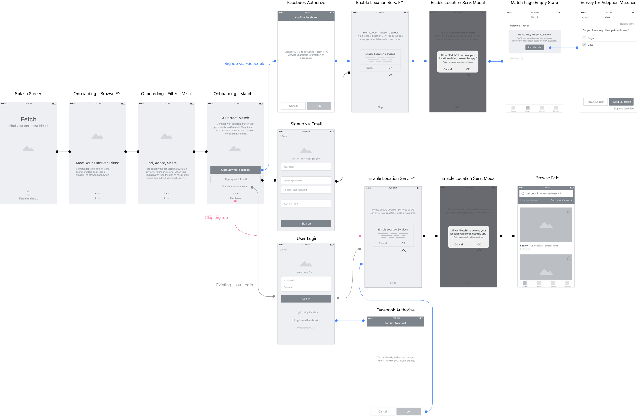
After sketching out the main flows and an application map, I turned my focus to more detailed interactions.
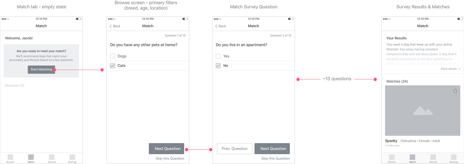
I found a large number of pet adopters don't do research because prior to choosing a pet because they find the process difficult. For this reason, I wanted users to be able to browse pets without having to sign up for an account. While the signup flow guides the user to the match test, they have the choice to skip it at any point and simply search for dogs.
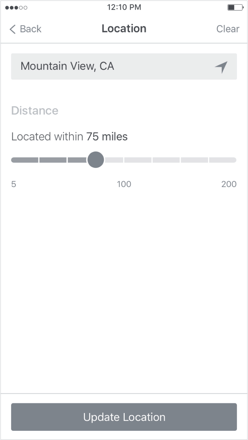
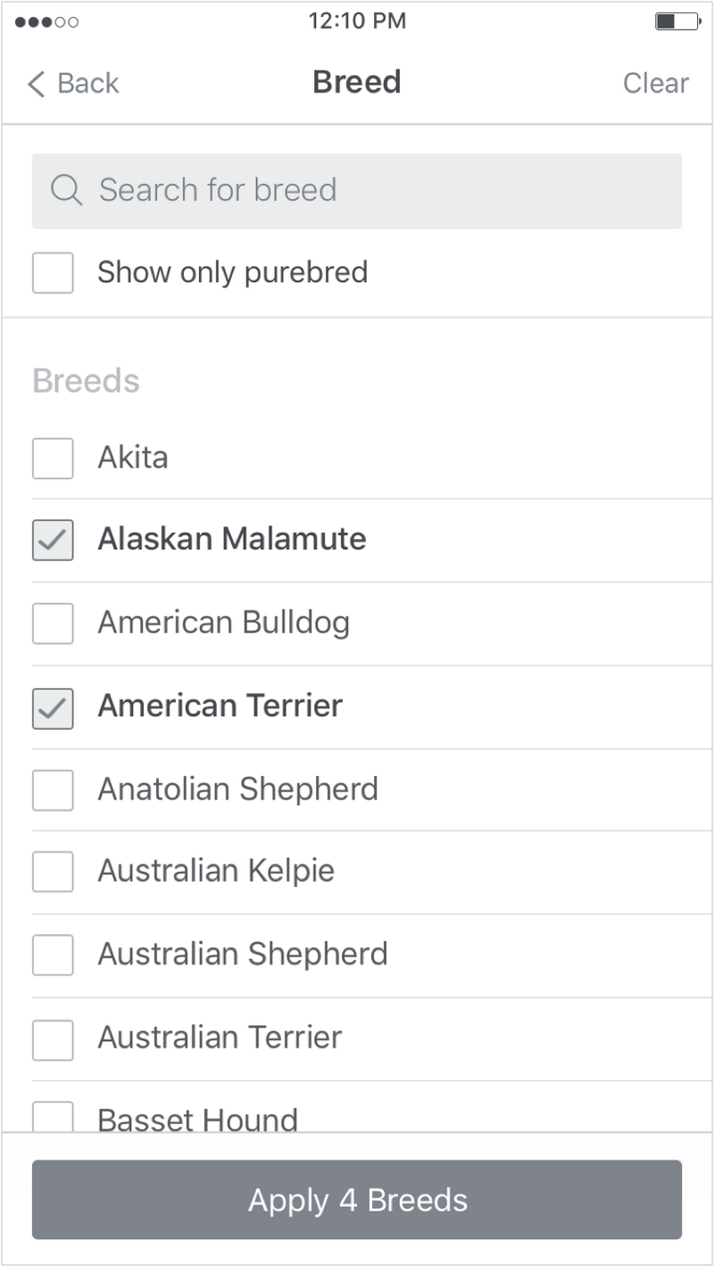
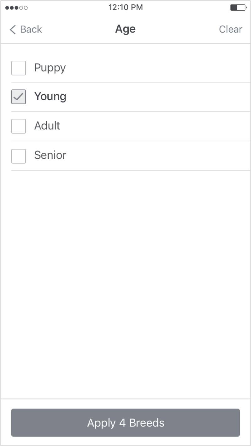
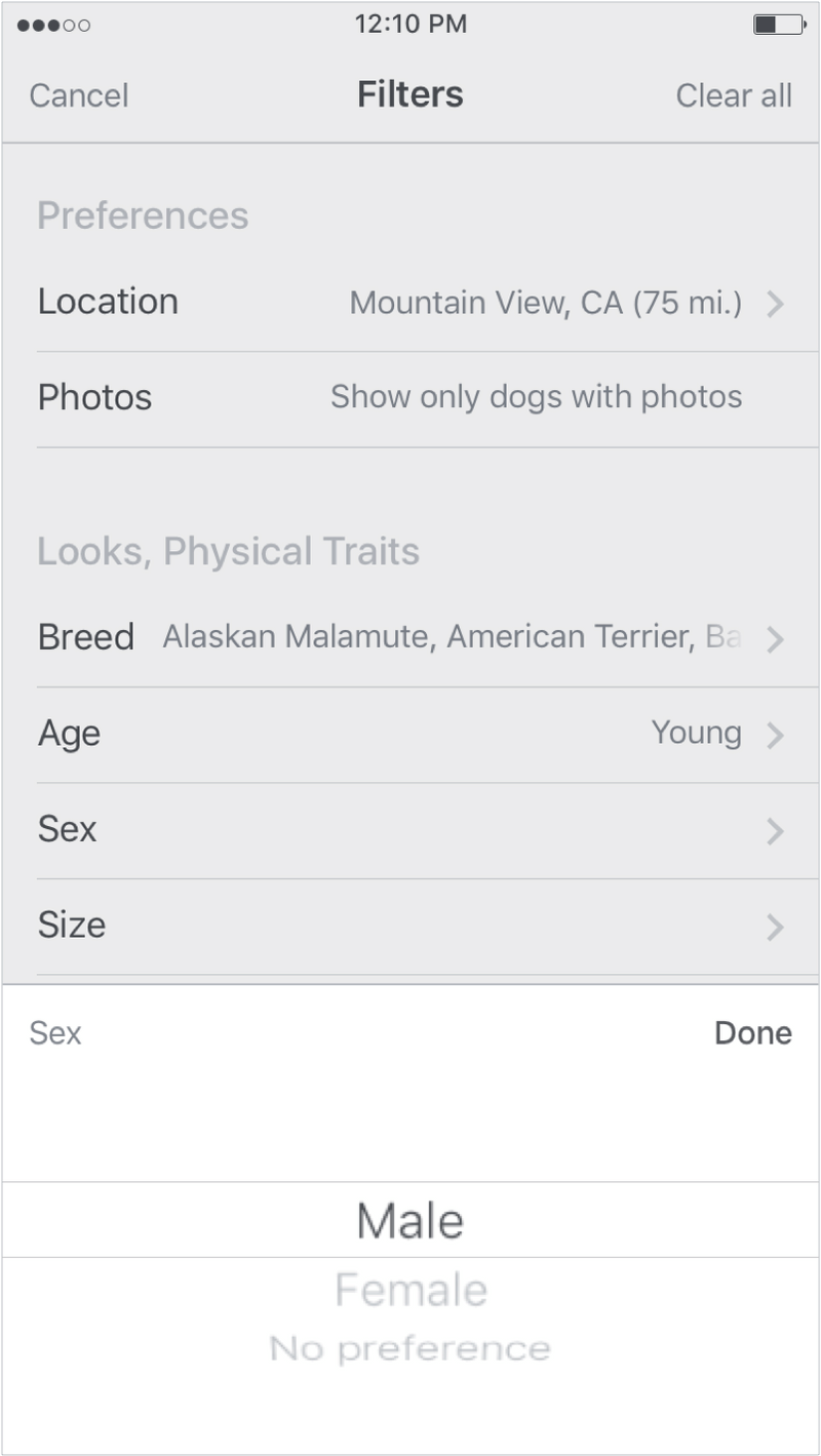
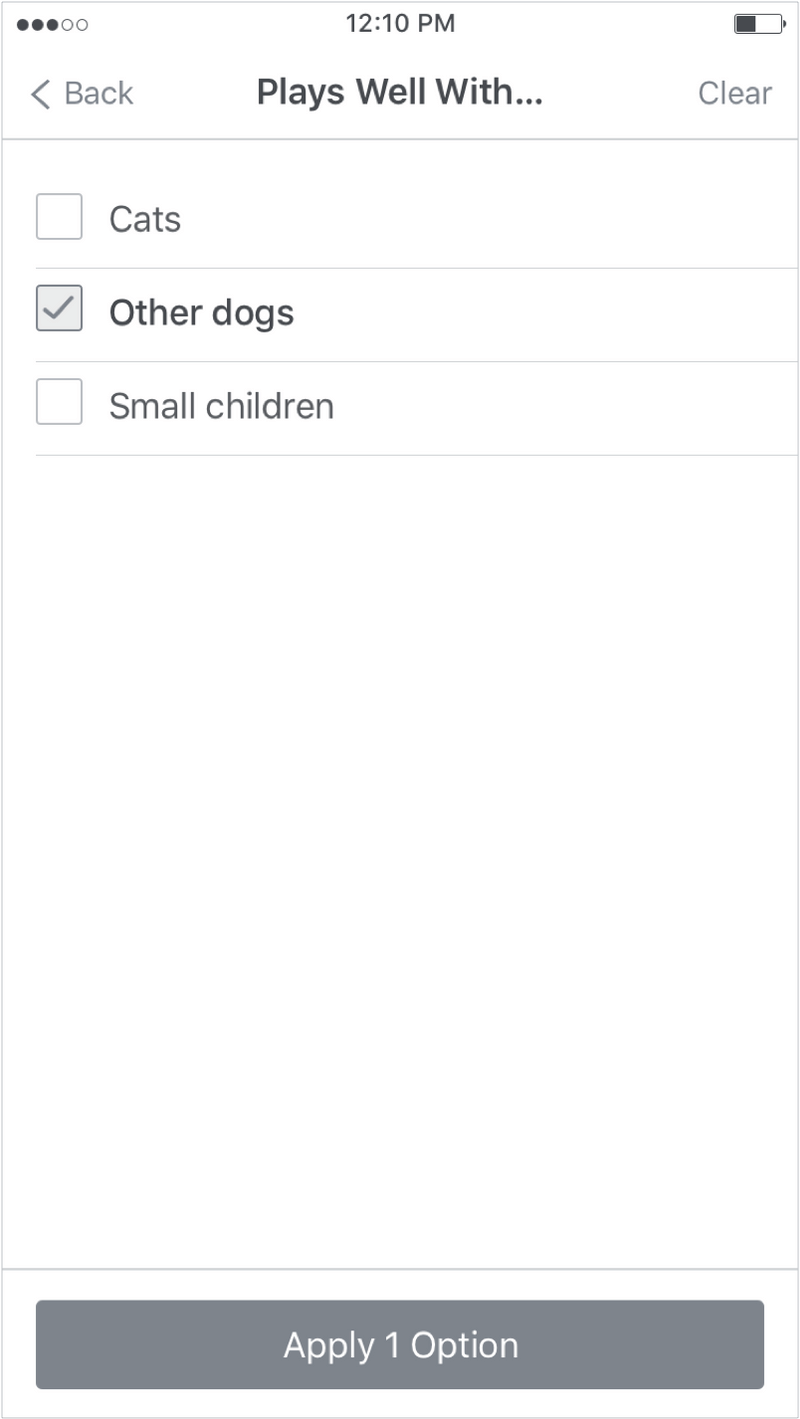
Users have quick access to the filters that are most important - breed, age and location. Since attraction is the top factor in choosing a pet, search results are displayed in a large card format similar to Instagram. Advanced filters are easily managed from the top bar.
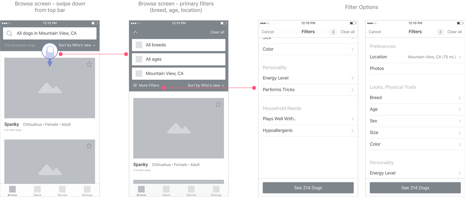

Users can sort by newly added pets, distance and relevance. Relevance is based on a user's survey results and/or breeds and other traits of pets they've recently visited.
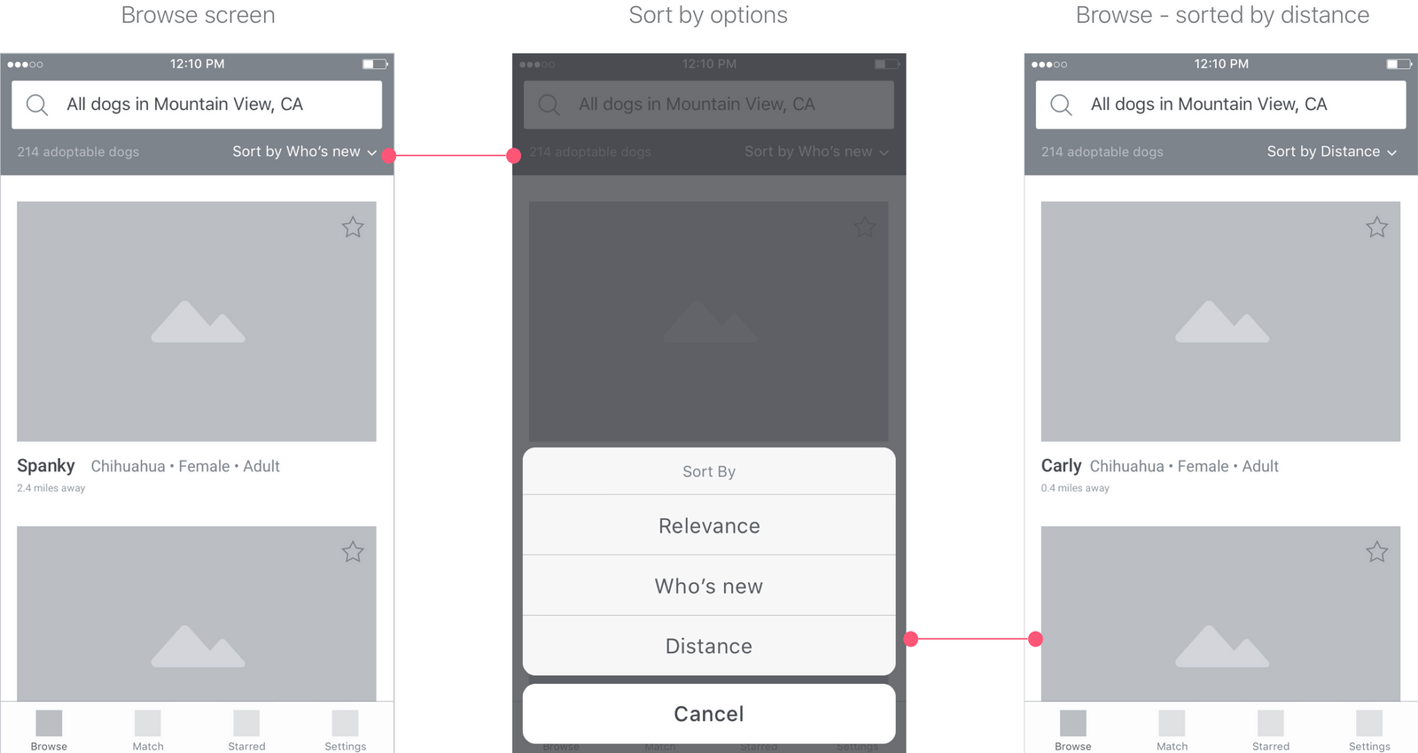
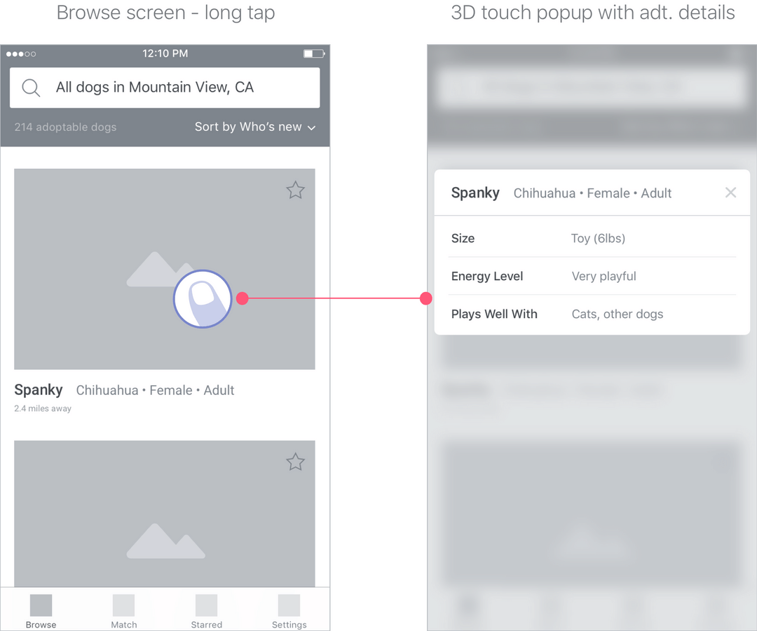
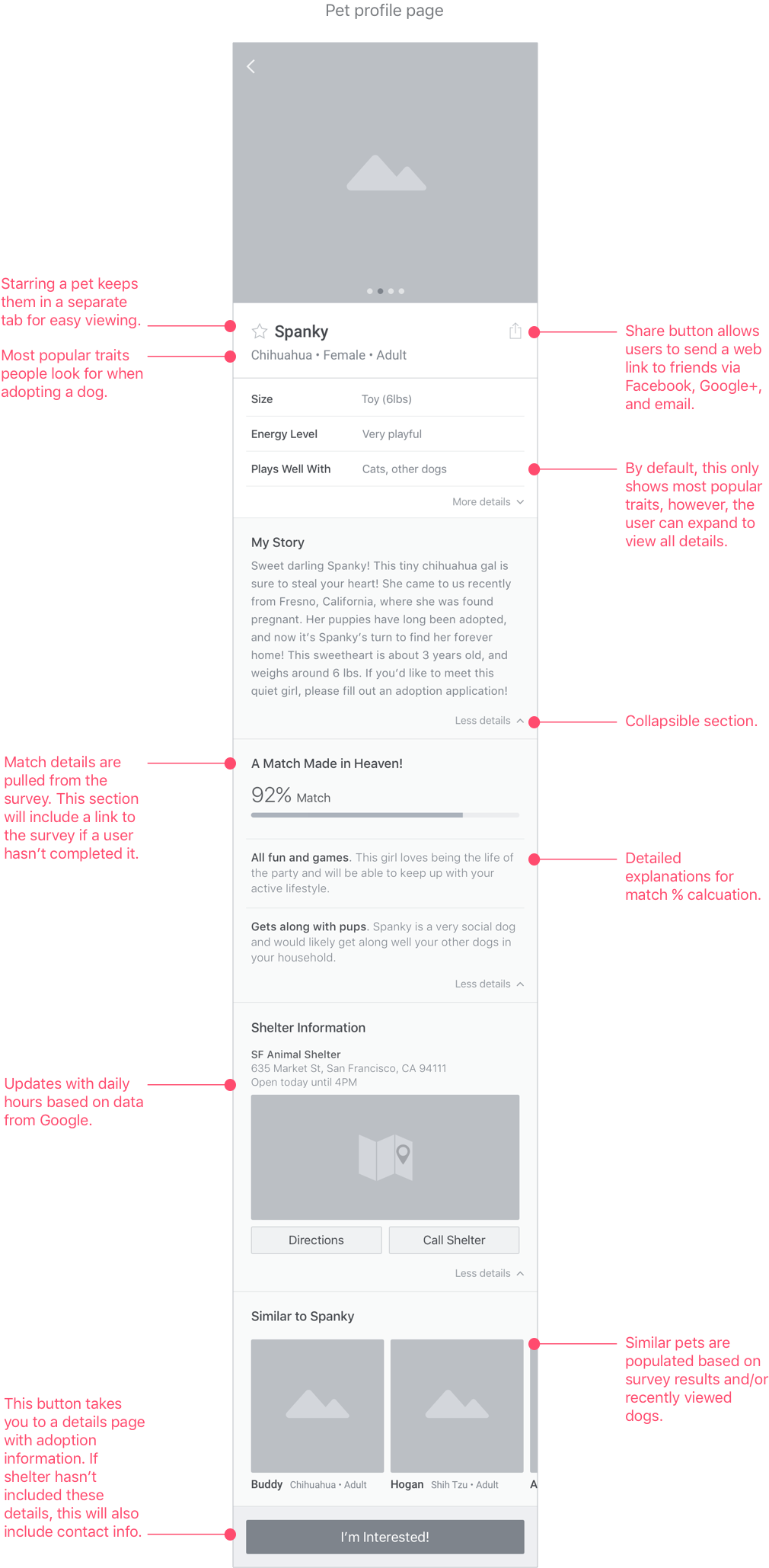
The browse page shows the most important traits to users. You can also do a long tap to enable a pop with 3D touch that shows additional stats without having to navigate to the pet's profile page.
I created wireframes of the general flow for the match test. Once a user completes the survey, the Match tab will periodically update with new pet matches and relevant resources that are added to Fetch.
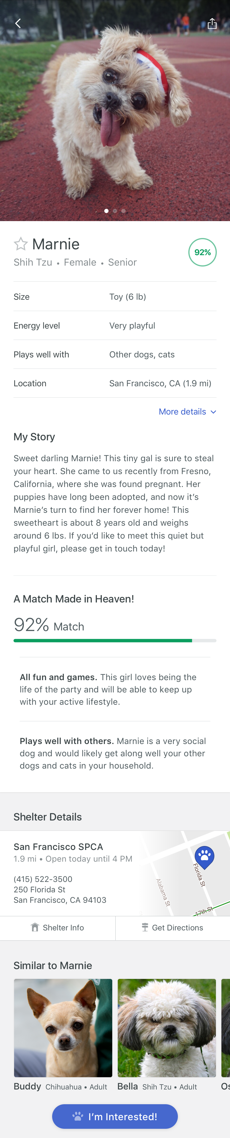
One of my main goals while designing the pet profile page was to show the most relevant content first. I organized the data in order of importance based on research and user feedback (appearance/visual, breed, behavior, etc.). I also tucked less important content in collapsible sections to cut down on scrolling through the page. This also tucks away stats that some pets might be missing.
Information from the survey is also displayed on individual pet profile pages. If a user has not taken the survey, they will see a link that section with a call to action (see below).
During this project, I captured a lot of research around animal shelters and even brainstormed opportunities and concepts to improve the adoption experience inside shelters. Given more time, I would like to have explored these ideas further and address some of the goals and current pain points from the perspective of shelter staff. An expansion of this project would include wireframes of a web application that allows shelter staff to integrate with their pet management system to automatically post and update adoption listings.
I also didn't address some app flows, including error handling and receiving an alert. This would be also be addressed next if the project continued along with explorations of micro-interactions that delight.
Finally, I realize I didn't define a monetization strategy. Aside from advertising, one idea worth exploring is to partner with pet services like pet insurance providers and incorporate these partnership deals with informational content.