Three Good,
Three Bad
Good and bad design is everywhere. For our first assignment, we had to identify three good and three bad examples of physical, digital and local design. For measurement, I turned to Dieter Rams’ ten principles for good design.
The Good
Physical: UE BOOM
The market may be flooded with Bluetooth speakers, but the
UE BOOM has a smart and thoughtful design that makes it stand out as a real winner. The 360-degree cylindrical design blasts amazing sound in all directions and the rugged acoustic skin is both water and stain resistant - seriously, I’ve used this thing in the shower and at the beach countless times. This product embodies good design, packing innovative technology in a stylish, yet functional form.
Digital: Google Material Design
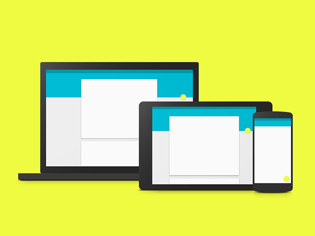
When Google announced its
new design language this summer, I couldn’t wait to check it out. While the company’s attempt to unify visual styles across the Web is a feat of its own, I was also very impressed with the overall design of Google’s online documentation. Instead of releasing a static PDF, the company created a dynamic site full of animations that shows the new design language in action. The comprehensive site not only lays out the guidelines for developers and designers, but also explains the rationale behind each element - a thorough and understandable approach.
Local: Mission Workshop
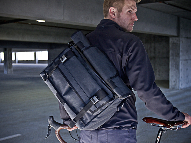
I never thought much about the use of bags beyond carrying items from place to place until I came across
Mission Workshop. The company considers all elements of design when constructing bags, creating a simple, clean aesthetic that’s both stylish and ready to take on the daily routine. The quality of construction is also superb and includes weatherproof fabrics with a durable tarp lining for easy maintenance.
The Bad
Physical: Google Glass
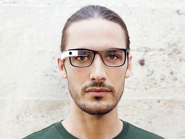
Google Glass might have pioneered the wearable technology space, but the physical design of the product misses the mark. While the device incorporates innovative technology, the bulky metal design is socially awkward and lacks style. In order for Google to move Glass beyond development stage and be adopted bythe masses, it needs to focus on aesthetics and develop a device that is both useful and unobtrusive. Otherwise, there might only be a few
white men wearing Google Glass.
Digital: Nintendo TVii
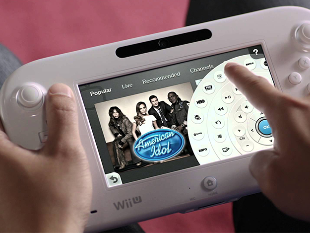
The Nintendo TVii for Wii U sounds great in theory: a touch-screen remote and smart program guide that incorporates online services into live television. However, one go at the app and you’ll likely end up wanting to toss your Gamepad at the screen. Nintendo TVii has one of the most unintuitive user interfaces and its sluggish performance makes it both easier and faster to get up from the couch to change the channel yourself or play a movie from your DVD player. While once an ambitious idea, the Nintendo TVii failed to accomplish anything – the service never caught on and Nintendo
issued an apology after abandoning the project.
Local: BART Transit System (San Francisco)

Having a positive experience on San Francisco’s BART transit system is too few and far between. Complaints about train delays and lack of late-night service are common among locals and have even become a
political issue in the upcoming elections. Good design is long-lasting, and many of these problems could have been avoided or at least mitigated while developing the transit system in the 1960s. BART officials say the system was never intended to be a 24-hour service when it was built and the majority of delays are the result of beyond aging equipment. If BART could have a do over, I’d suggest developers put more focus on building a sustainable-long term transit system.