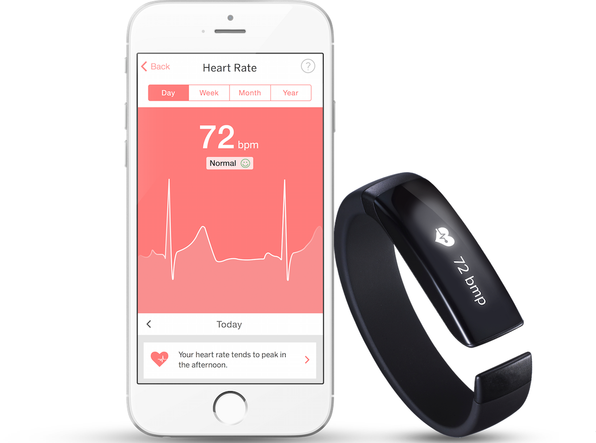
Pulseband is a concept wearable device that measures a user’s heart rate, blood pressure, steps and sleep activity, among other vitals. The device is specifically designed to accommodate people with certain heart conditions as well as those at risk of developing related conditions.
As part of an exploratory project at DESIGNATION Labs, my team was tasked with creating a companion mobile app for the Pulseband that allows users to easily visualize and understand their data. Our app development process included UX flows, wireframes, prototypes and UI design.

Following agile methodology, my team created a research plan to help understand user needs and requirements for the product. We collected extensive research on causes, symptoms and treatments for heart-related conditions and evaluated competitors to assess their strengths and weaknesses against our user’s needs.
We also conducted a range of interviews with potential users and health practitioners to identify user goals and pain points. We then synthesized our research to identify insights and created personas, user scenarios and other tools to guide the next phase of the project.
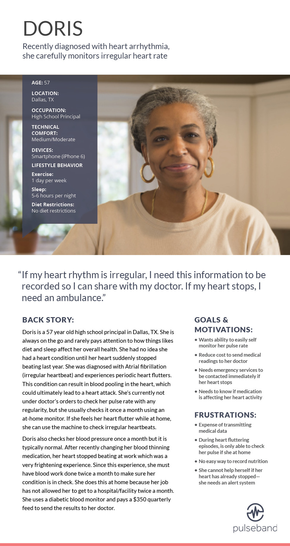
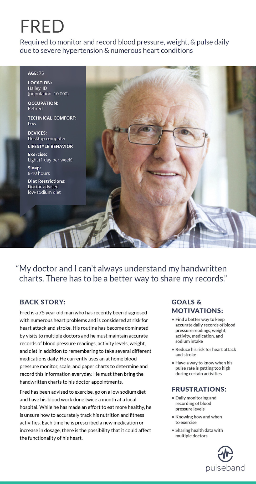
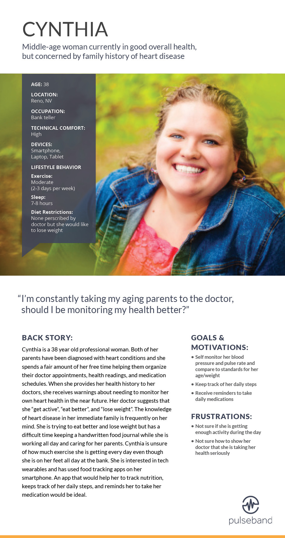
Based on our research, we created three primary personas to represent the goals, motivations and behaviors of our target demographic. We used these personas throughout the project to guide design decisions and priorities.
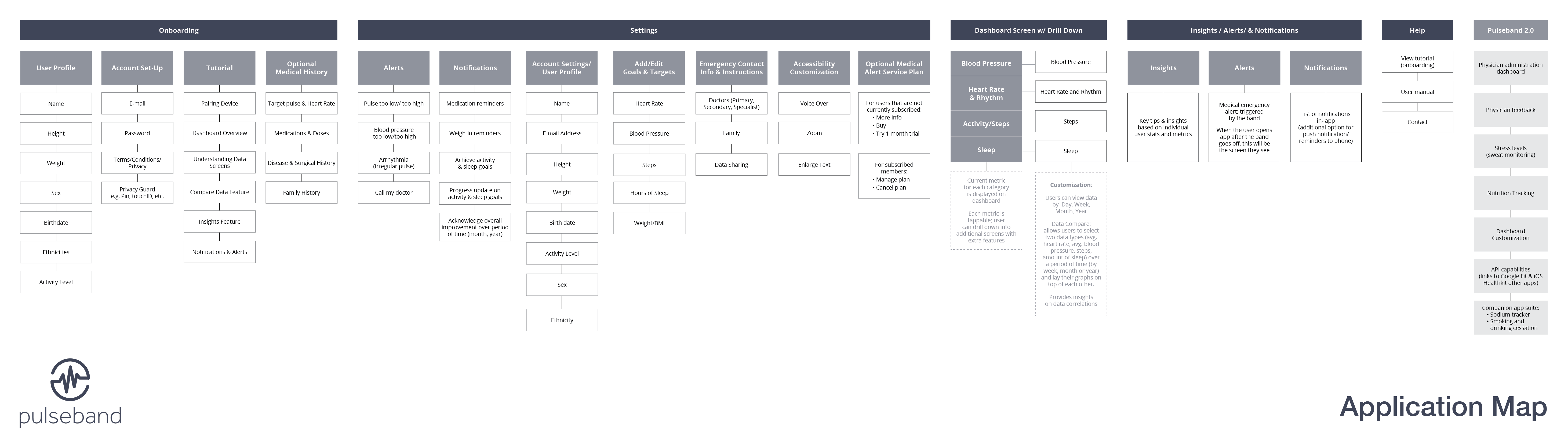
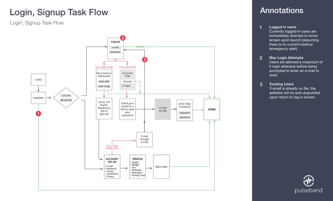
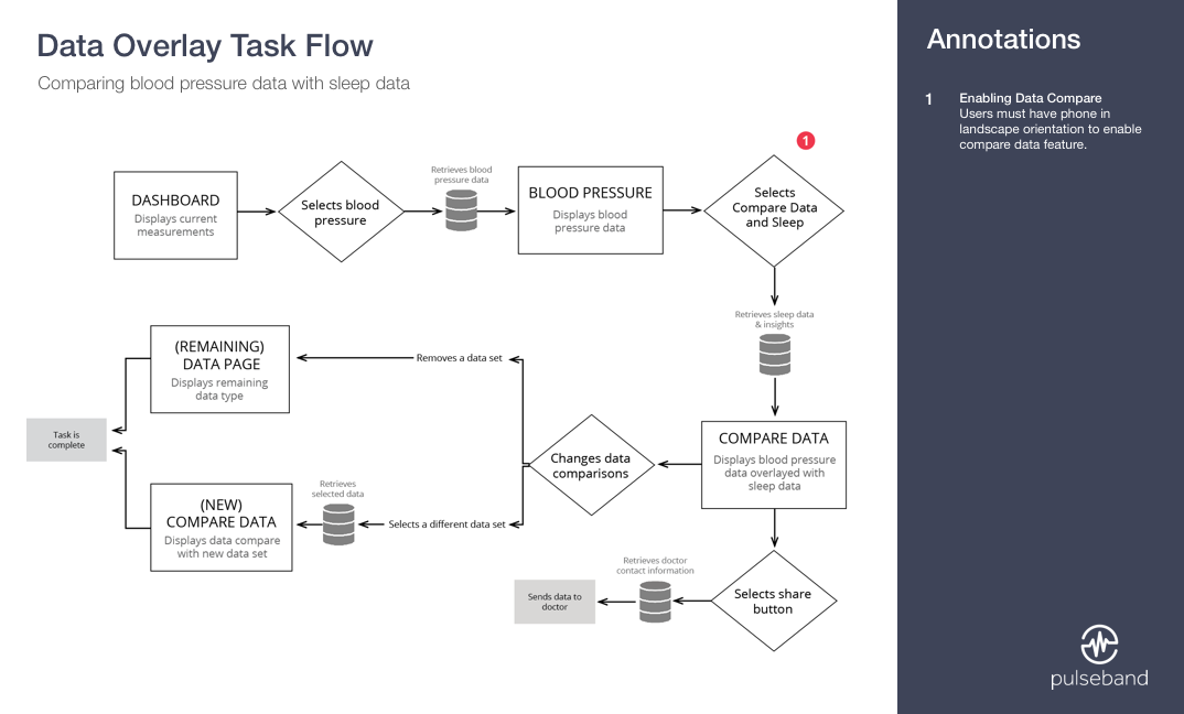
Before starting any visual design, we focused heavily on how users will navigate the app and what content they will need to support them in their goals. During this phase of the project, we created an application map and numerous task flows that evolved into a framework for developing the wireframes.
The application map provides an overall snapshot of the structure and navigation of the app. It served as a reference point while creating various task flows and wireframes.
Numerous task flow diagrams were created to show how a user navigates through the app while performing specific tasks. These diagrams helped us prioritize and structure content and eliminate potential pain points.
More than 60 wireframes were created to serve as a visual guide for the design phase of the project.
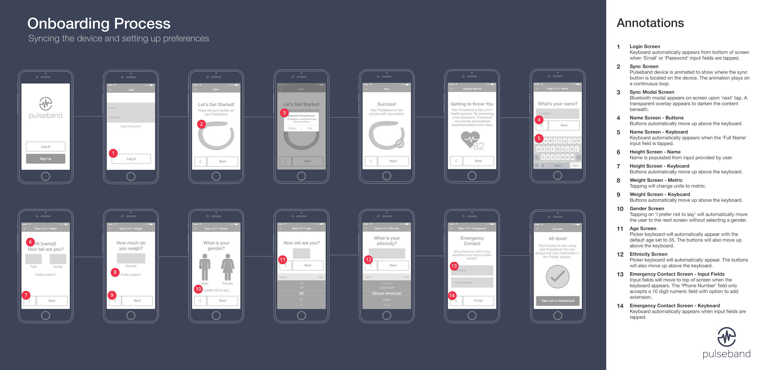
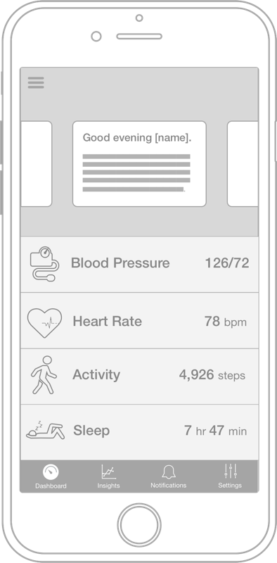
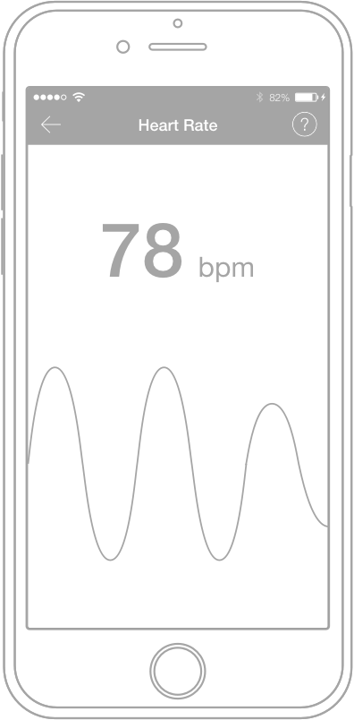
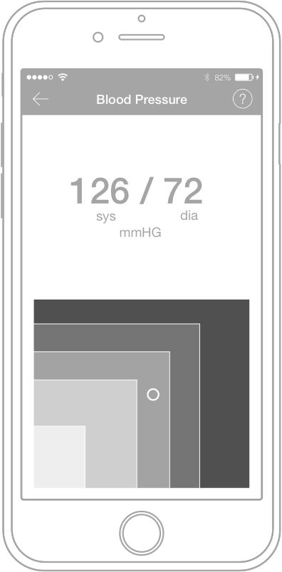
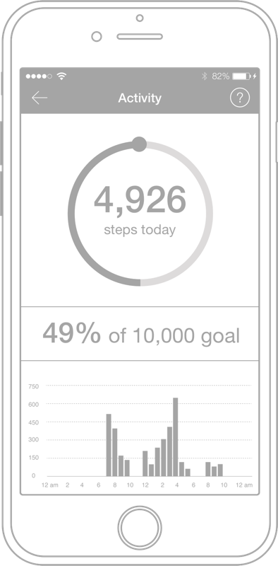
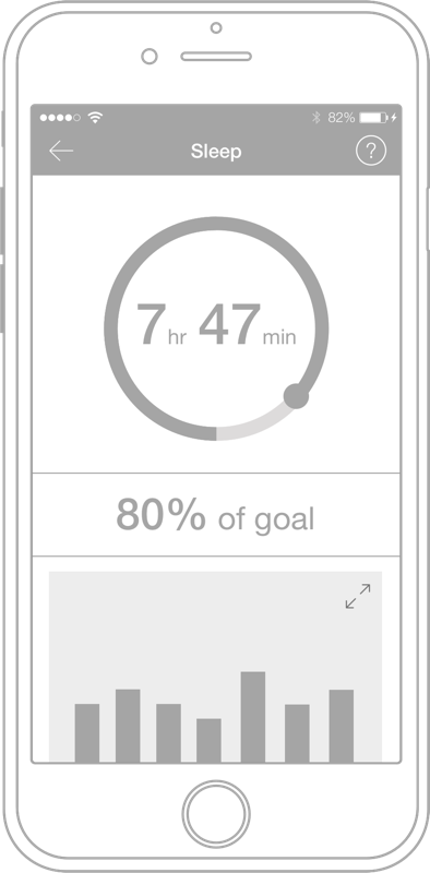
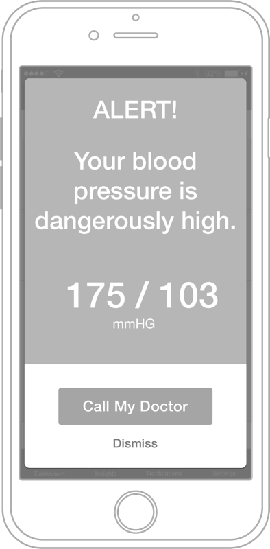
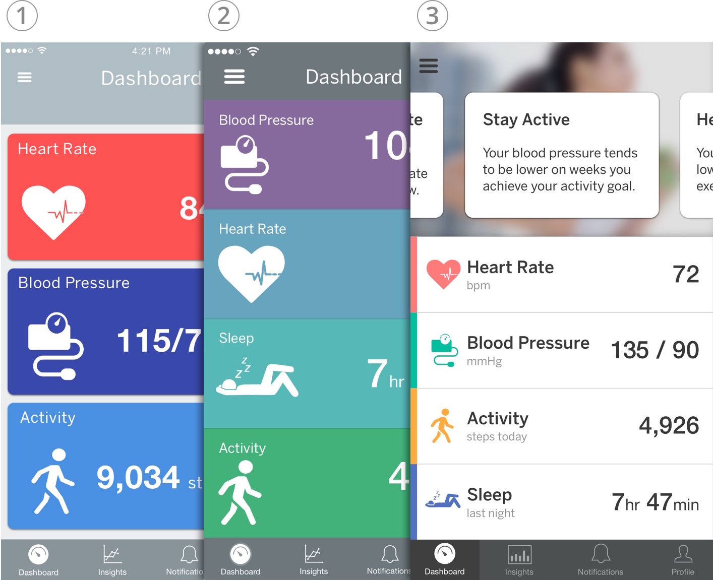
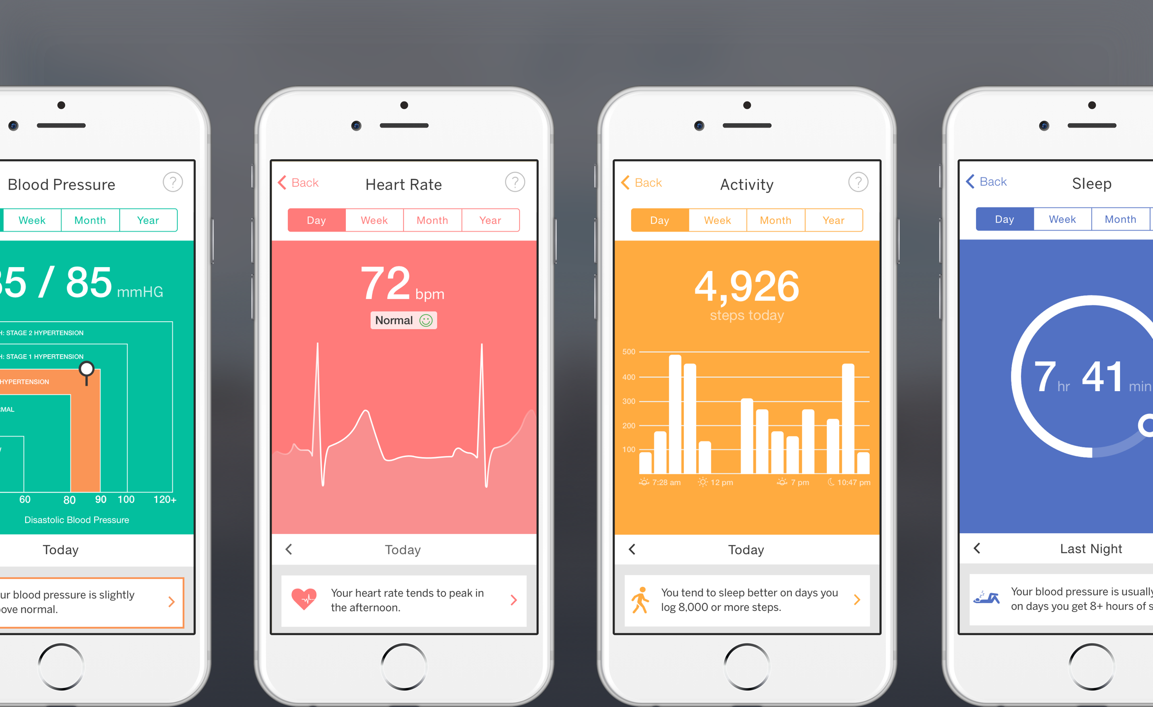
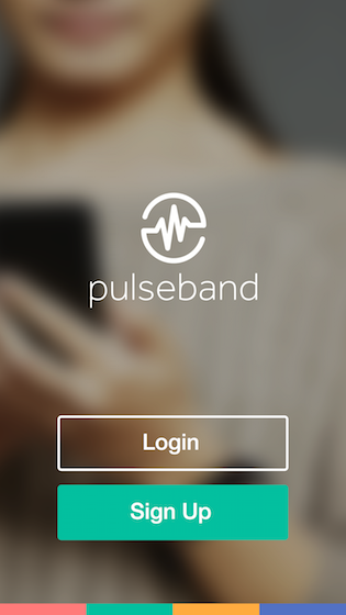
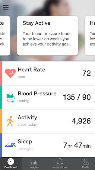
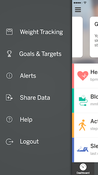
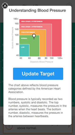
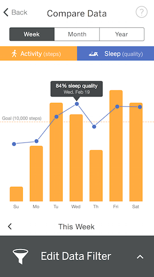
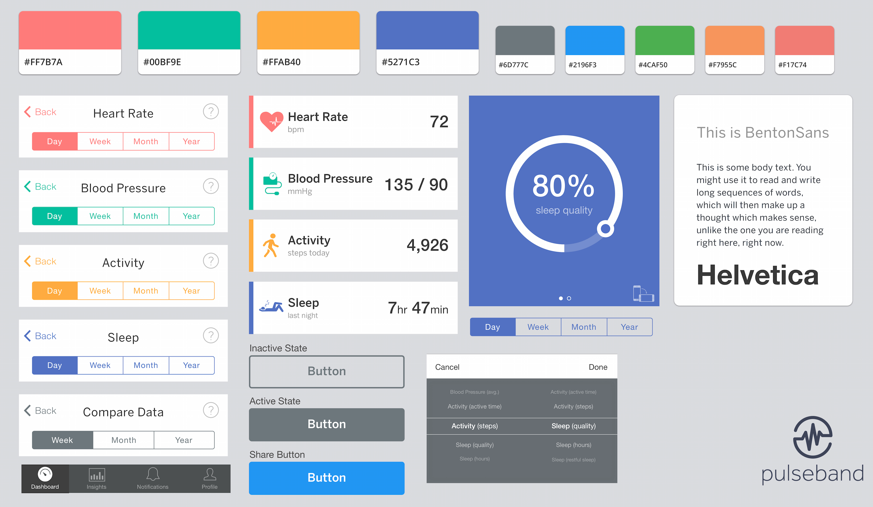
I created high-fidelity mockups of the app, including the dashboard, all data measurements, settings, alerts and notifications. During this phase, we explored numerous ways to visualize the complex health data and make it digestible for the user.
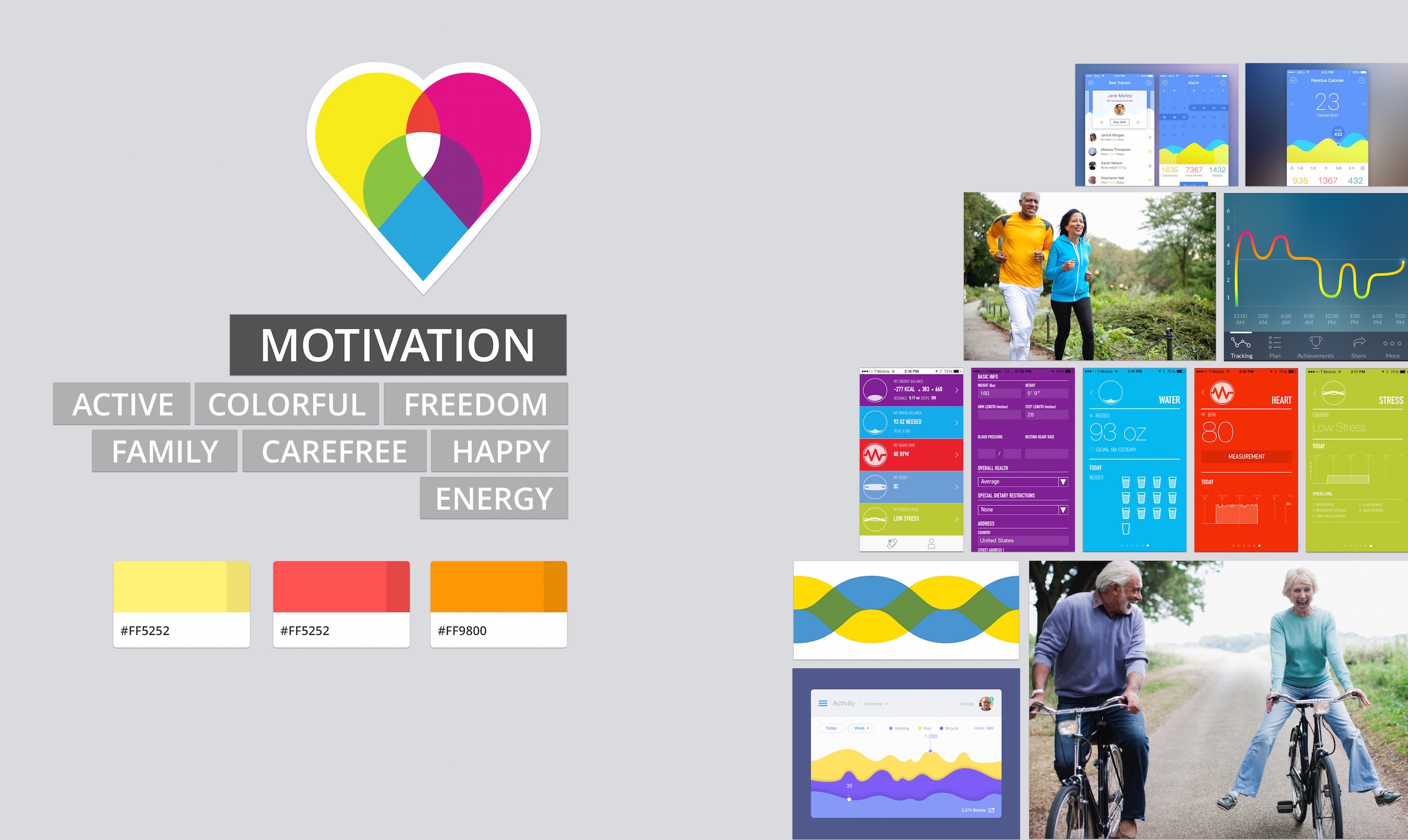
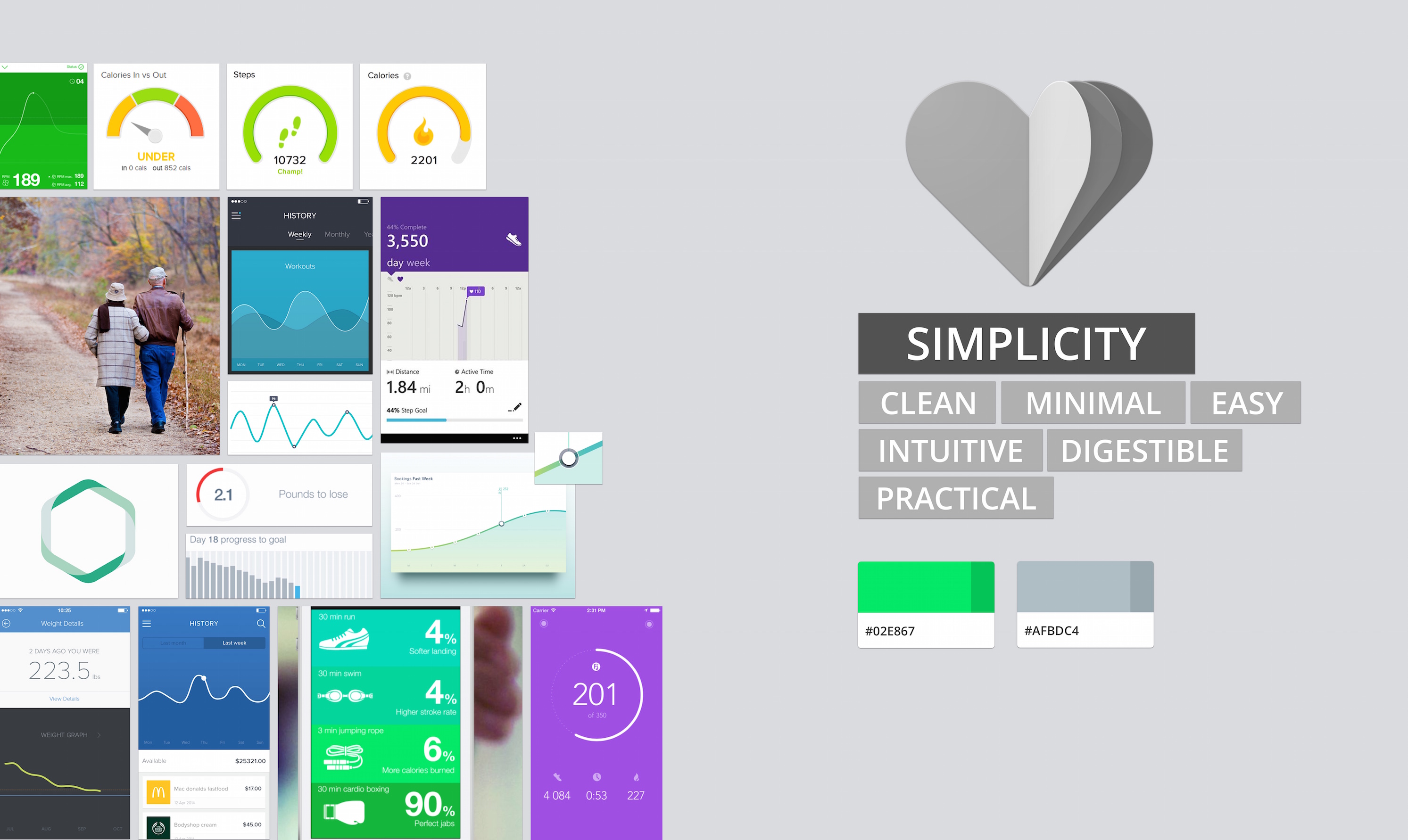
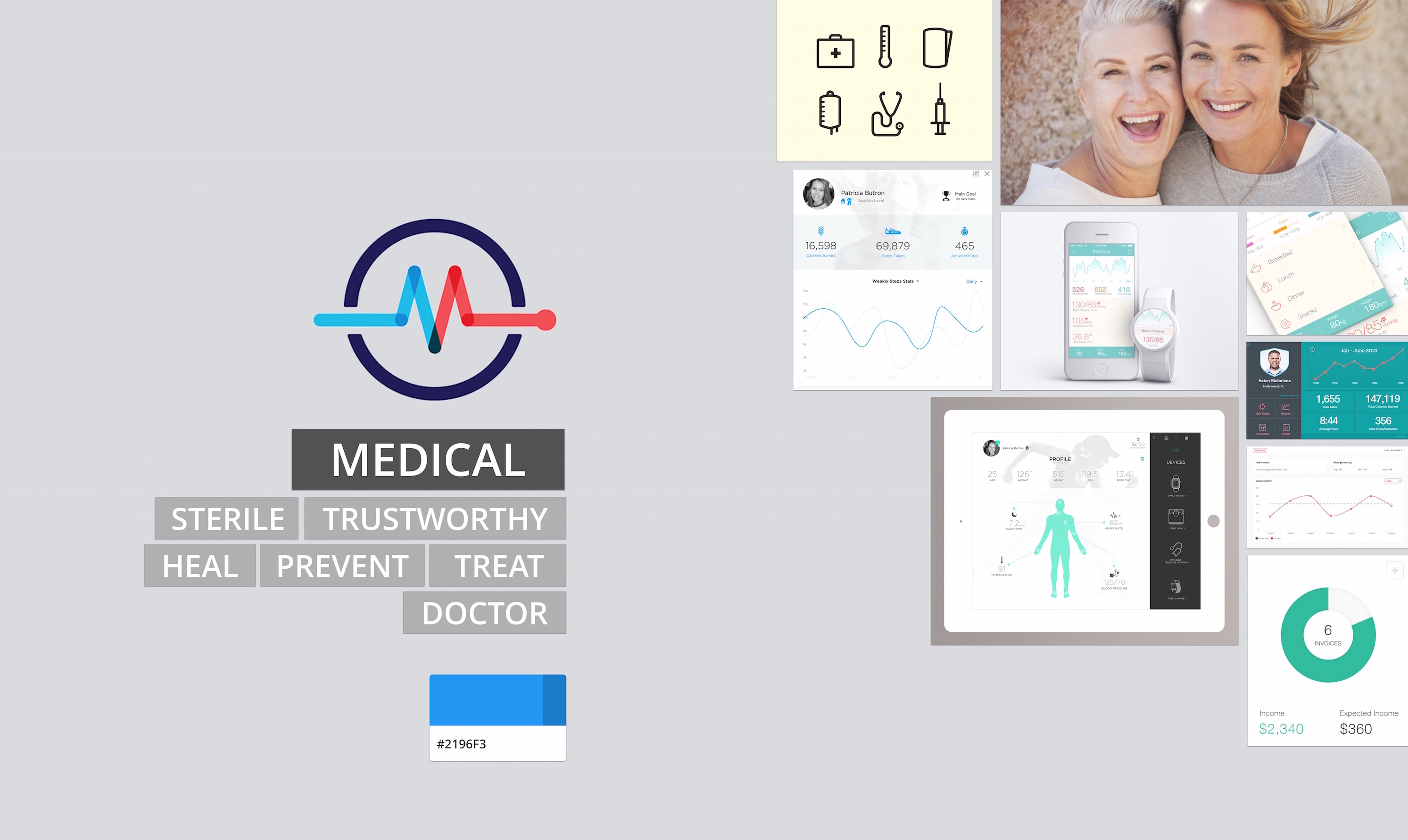
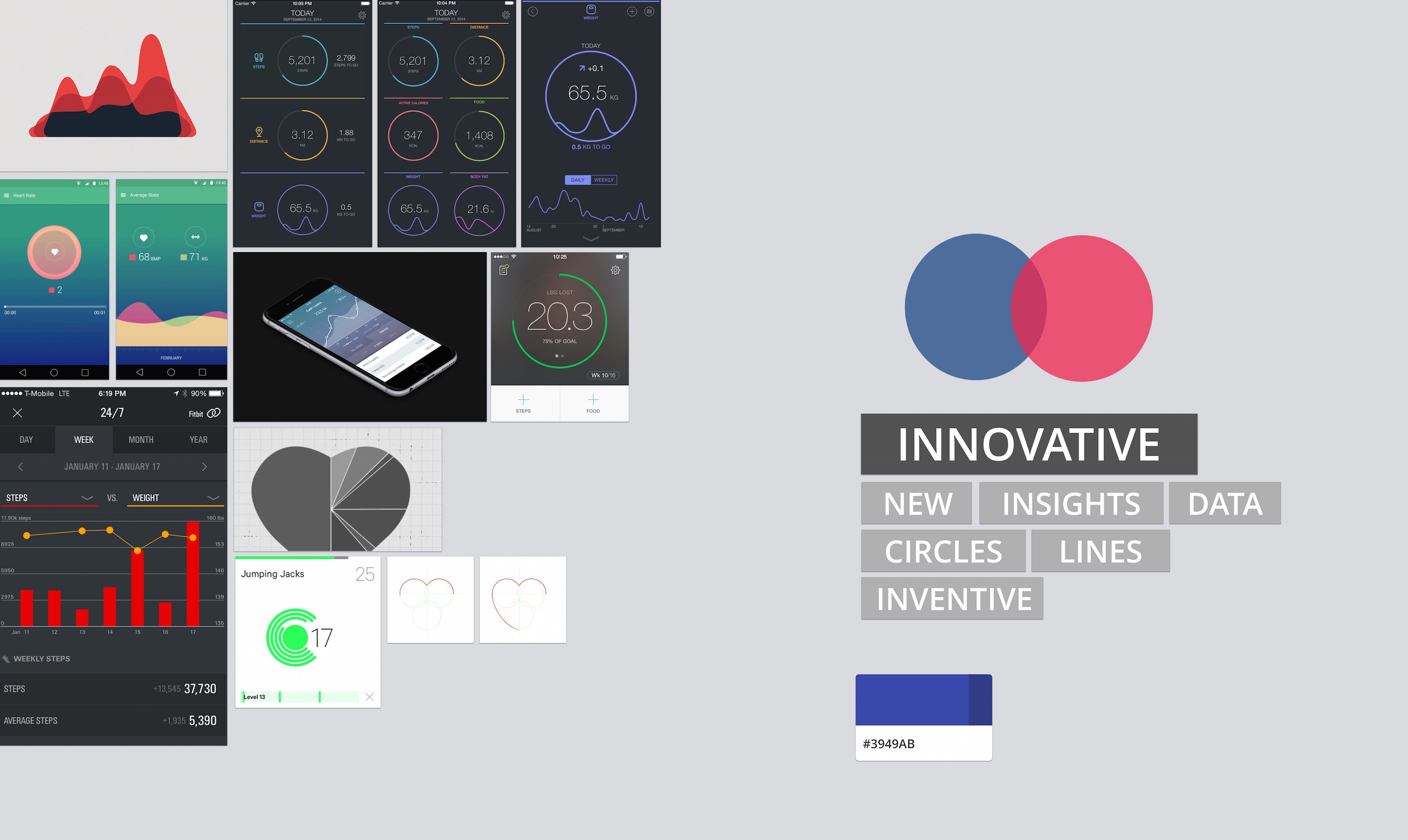
We started collecting pieces for the mood board while creating the wireframes to help define the look and feel of the coming design.
I created a style tile to serve as a visual reference while creating high-fidelity mockups of the app.
User testing and other evaluation methods led to three major design iterations throughout the project. While the dashboard had a similar structure from start to finish, important details were constantly refined.